In the modern digital economy, direct-to-consumer brands and enterprise corporations alike invest heavily in crafting visually stunning email campaigns. However, a persistent disconnect remains between aesthetic polish and tangible consumer action. Industry metrics consistently demonstrate that highly stylized emails—often featuring intricate custom illustrations, complex multi-column grids, and heavy graphic branding—frequently underperform compared to their stripped-down, text-forward counterparts. This paradox has forced marketing professionals and UX designers to reevaluate the core purpose of email design: moving away from digital art galleries and toward frictionless conversion pathways.
The Aesthetic Fallacy: Why Beautiful Emails Fail
The pursuit of artistic perfection in email marketing often stems from a fundamental misunderstanding of user psychology. When a founder or marketing director reviews an email draft on a high-resolution desktop monitor in a quiet office, they evaluate the layout as an independent piece of graphic design. They look at brand color harmony, typographic hierarchy, and illustrative flair.
Yet, the recipient experiences the email under entirely different conditions. An average consumer opens dozens of promotional messages a day while commuting, standing in line, or multitasking in front of a television. In these high-distraction environments, elaborate visual elements cease to be engaging assets and instead become cognitive bottlenecks. When an email resembles a complex menu of competing offers—highlighting a new blog post, a loyalty program update, a podcast episode, and a product sale all at once—the reader experiences decision fatigue. Confronted with multiple competing calls to action, the brain defaults to the easiest possible behavior: taking no action at all.
Establishing a Single Conversion Objective
To reverse declining engagement rates, successful digital strategists adhere to a strict foundational rule: every email must have one job. Before a single pixel is placed or a line of copy is written, the campaign must be anchored to a singular, unambiguous verb. Whether the objective is to purchase a specific product, register for a webinar, or read a deep-dive industry report, that primary action must dominate the layout.
This approach requires ruthless editing. Marketers must abandon the impulse to cram secondary and tertiary announcements into a single broadcast. When an organization attempts to monetize every square millimeter of digital real estate, it dilutes the primary message. Empirical data across multiple e-commerce sectors shows that focused campaigns featuring a single, clear ask consistently achieve higher click-through rates than cluttered newsletters that politely request three or four different actions. Secondary announcements are far better suited for dedicated follow-up sequences or automated lifecycle flows.
Optimizing for the Mobile-First Reality
Statistical analysis of consumer inbox behavior reveals that mobile devices account for the vast majority of all email opens. Despite this reality, many marketing teams continue to design desktop-first layouts that fracture, distort, or become entirely illegible when scaled down to a smartphone screen.
Designing for the thumb requires a fundamental shift in layout architecture. Effective mobile optimization relies on single-column structures that eliminate horizontal scrolling and prevent multi-column layouts from collapsing into visual chaos. Furthermore, typography must be scaled for immediate legibility without pinching or zooming; industry standards recommend a minimum of 16 pixels for body copy.
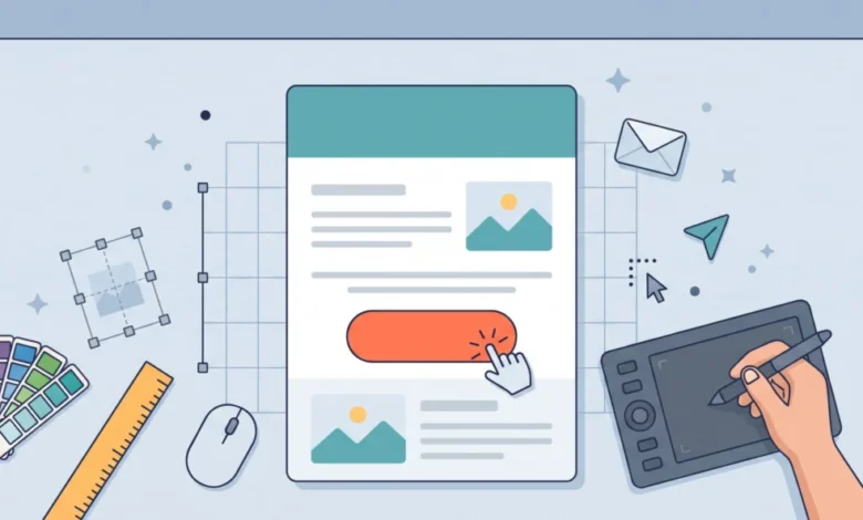
Crucially, the primary call to action—typically formatted as a distinct, high-contrast button—must be large enough to be easily targeted by a thumb on a touchscreen. It must also be isolated with ample whitespace. Cramming a button between dense paragraphs of text strips it of its navigational authority, causing it to blend into the background. Conversely, surrounding a solid-block button with breathing room signals its interactive nature instantly. Moreover, the microcopy within the button must be descriptive and action-oriented. Vague terms like Submit or Click Here demand extra cognitive processing, whereas phrases like Shop the Sale or Claim My Discount clearly articulate the immediate value exchange.

Mitigating Technical Vulnerabilities in Image-Heavy Layouts
A common vulnerability in contemporary email design is over-reliance on a single, monolithic hero image that houses the primary headline, product imagery, and call-to-action button baked directly into the JPEG or PNG file. While visually seamless, this practice introduces significant operational risks.
Inbox providers frequently block images by default to protect user security and data privacy. Furthermore, variable network speeds, weak cellular signals, and widespread implementation of dark mode can render graphic-heavy emails completely unreadable. A white-background graphic viewed in dark mode can easily transform into an unappealing grey smudge, leaving the recipient staring at a blank rectangle and a broken image icon.
To safeguard deliverability and user experience, developers enforce a strict separation between images and text. Headlines, body copy, and interactive buttons must be constructed using live, styled text rather than embedded pixels. Every image must be paired with descriptive alt text to ensure context remains intact if the visual fails to load. By treating images as supportive enhancements rather than foundational structural elements, brands protect their conversion funnels against technical friction.
Building for the Scan Economy
Data regarding digital consumption habits indicates that readers do not methodically parse promotional emails from top to bottom on an initial pass. Instead, they execute rapid visual scans lasting mere seconds. The structural hierarchy of the email must accommodate this scanning behavior.
An effective layout features a prominent, value-driven headline at the top, followed by concise paragraphs restricted to two or three lines with generous line spacing. Subheadings and bold lead-ins guide the eye naturally down the left margin and through the center of the page. Designers frequently employ the squint test—blurring their vision while looking at the layout—to determine if the primary call-to-action button remains the most visually arresting element on the screen. If a secondary stock photo or decorative illustration overshadows the conversion button, the visual hierarchy requires immediate correction.
Technological Integration and Workflow Efficiency
As marketing automation platforms evolve, the tooling available to creative teams has adapted to bridge the gap between high-level design and functional deployment. Modern software ecosystems now emphasize cross-platform compatibility, allowing design professionals to work within collaborative environments like Figma and synchronize their layout components directly into enterprise email marketing libraries, such as Omnisend.
This technological integration reduces human error, eliminates the need for manual rebuilding, and ensures that cross-functional teams—from brand designers to campaign managers—maintain absolute fidelity to the intended visual identity. Furthermore, streamlined migration services offered by modern platforms allow brands to transition legacy workflows, automated triggers, and historical templates in a matter of days, often resulting in reduced operational overhead and improved inbox placement.
Broader Implications and Strategic Outlook
The ongoing evolution of email design underscores a broader maturation within the digital marketing sector. As consumer inboxes become increasingly saturated, aesthetic novelty is losing its effectiveness as a primary driver of revenue. Sustainable growth is no longer achieved through visual ornamentation, but through disciplined clarity, rigorous mobile optimization, and an unwavering focus on user intent.
Brands that embrace this functionalist philosophy—stripping away decorative clutter to elevate the core message—will continue to outperform competitors who prioritize design awards over measurable engagement. Ultimately, the most successful email campaigns are those that respect the reader’s time, remove friction from the path to purchase, and make the next logical step entirely undeniable.