Amazon QuickSight Introduces Mobile Layout for Free Form Dashboards, Revolutionizing On-the-Go Data Access

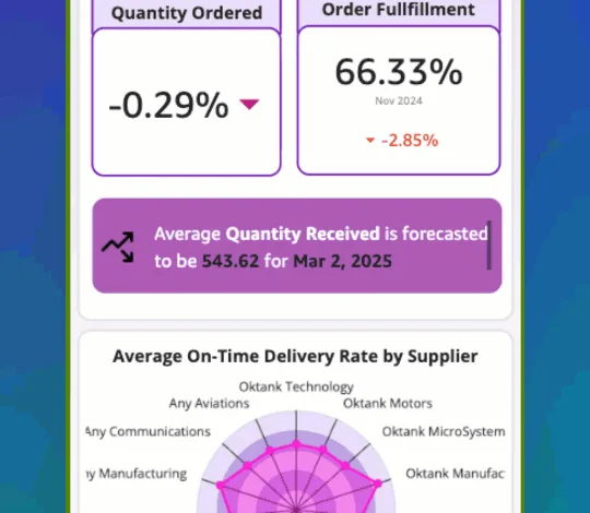
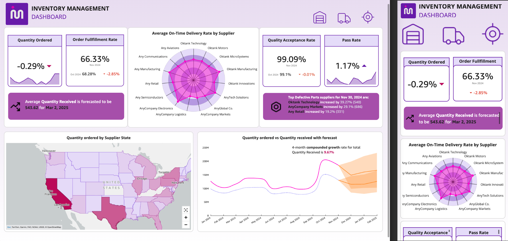
Amazon QuickSight has unveiled a significant enhancement for its Free Form dashboards with the introduction of "Mobile Layout," a feature designed to eliminate the frustration of interacting with desktop-optimized dashboards on mobile devices. This new functionality automatically transforms Free Form dashboards into a single-column, touch-optimized view that seamlessly fills the device screen, offering users immediate access to critical data without the need for pinching, zooming, or horizontal scrolling. The feature is now available across all supported AWS Regions, marking a pivotal moment for mobile business intelligence and data-driven decision-making in dynamic environments.
For professionals who rely on real-time data for daily operations – whether it’s checking revenue figures during a morning stand-up meeting, reviewing sales pipeline metrics between client calls, or monitoring operational performance while traveling – the limitations of desktop-centric dashboards have long been a source of inefficiency. Previously, accessing and interpreting this vital information on smartphones or tablets often involved cumbersome navigation, leading to delays and potential inaccuracies in time-sensitive situations. Mobile Layout directly addresses these pain points by fundamentally rethinking how dashboards are presented and consumed on smaller screens.
Transforming the Mobile Data Experience
The core innovation of Mobile Layout lies in its intelligent rendering capabilities. When a user opens a Free Form dashboard on a device with a small viewport, Amazon QuickSight automatically detects the screen size and activates the mobile view. This view reorganizes the dashboard’s elements into a continuous, vertically scrollable feed. Each visual element, from key performance indicators (KPIs) to complex charts, is automatically resized to span the full width of the device screen, while crucially preserving its original aspect ratio. This ensures that the integrity and clarity of the data visualizations are maintained, regardless of the original design intended for a larger desktop canvas.
This automated transformation means that dashboard creators do not need to undertake any additional work to benefit from this new functionality. Existing Free Form dashboards will automatically adapt to the mobile experience for their readers. This "set it and forget it" approach significantly lowers the barrier to entry for mobile-friendly data access, democratizing the ability to stay informed on the go. The implications are far-reaching, enabling a more agile and responsive approach to business operations across diverse industries, from sales and marketing to operations and finance.
Key Capabilities Driving Mobile Efficiency

Mobile Layout is not merely a resizing tool; it incorporates several sophisticated capabilities to ensure a robust and user-friendly mobile experience:
-
Continuous Scroll: This is the cornerstone of the mobile experience. Visuals are stacked in a single column, creating an uninterrupted flow of information. Each visual occupies the entire viewport width, and its original proportions are maintained. This is particularly beneficial for understanding trends and comparisons as users can smoothly navigate through a series of related data points.
-
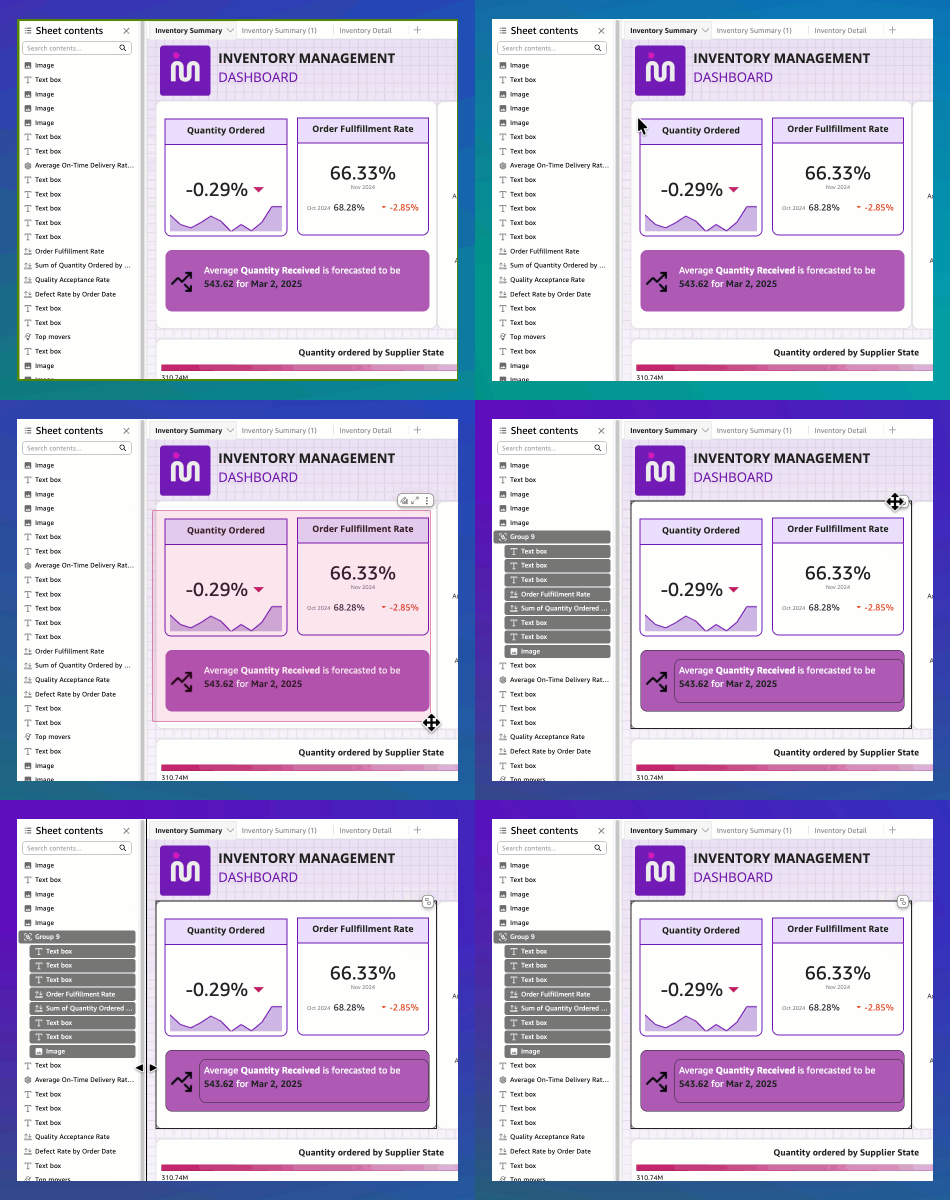
Group-Aware Rendering: Free Form dashboards often utilize overlapping visuals to create rich and layered designs, such as KPI values displayed on a colored background or comparison cards placed over a container. Mobile Layout intelligently respects these "group boundaries." When visuals are grouped by the author, they are rendered together as a single cohesive unit on mobile devices, preserving the intended layered design and visual hierarchy. This is a critical feature for maintaining the narrative and context of complex visualizations.
-
Reader Controls and View Switching: Recognizing that different users and situations may require different viewing perspectives, Amazon QuickSight provides built-in controls. Within the QuickSight mobile application, users can switch between the optimized "Mobile view" (continuous scroll) and the original "Desktop view." For users accessing dashboards via a mobile browser, portrait orientation defaults to the mobile experience, while landscape orientation renders the desktop experience. This flexibility empowers users to choose the view that best suits their immediate needs and device orientation.
-
Performance Optimization: A significant challenge with mobile data access has been performance. Dashboards, especially those with complex calculations or numerous visuals, can strain mobile device resources. Mobile Layout has been engineered with an optimized rendering path that significantly reduces resource consumption on mobile devices. This translates to faster loading times and smoother scrolling, even for dashboards that previously struggled to perform adequately on phones. Early testing and adoption indicate substantial improvements in user experience, particularly for those frequently accessing data remotely.
A Seamless Transition for All Users
The beauty of Mobile Layout for Free Form dashboards lies in its universal applicability and minimal implementation effort.
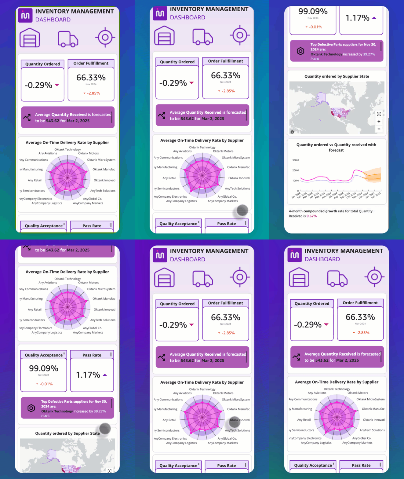
For dashboard readers, the experience is immediate and frictionless. There are no settings to adjust, no migrations to perform, and no updates to install. Simply opening an existing Free Form dashboard on a supported smartphone or tablet will automatically present the optimized mobile view. This accessibility ensures that everyone, from seasoned analysts to frontline staff, can readily access the data they need, when and where they need it.
For dashboard authors and administrators, the transition is equally effortless. Authors of Free Form dashboards do not need to make any changes to their existing dashboards. The Mobile Layout feature is automatically applied to their published works on smaller screens. Authors using Tiled or Classic layouts are not impacted by this change; those layout types retain their established responsive behaviors. Similarly, administrators do not need to perform any configuration tasks. Mobile Layout is active by default for all Free Form dashboards across an AWS account, ensuring widespread benefit without additional administrative overhead.
Optimizing the Mobile Experience with Grouping
While Mobile Layout is designed to work out-of-the-box, authors have an optional, yet highly recommended, step they can take to ensure their dashboards translate optimally to the mobile environment: organizing overlapping visuals into Groups.
In Free Form layout, it’s common practice to layer visuals for enhanced design and information density. For instance, a KPI value might be placed directly on top of a colored background shape, or a series of comparison cards might be overlaid on a container element. On a desktop screen, these layered elements render as intended, creating a cohesive visual. However, on a mobile screen, the layout engine must interpret how to present these overlapping elements.
Without explicit grouping, each individual visual within an overlapping set could be rendered as a separate "card" in the mobile scroll. This means a KPI positioned on a background image might appear as distinct elements: the background as one card, and each KPI as a separate card. While the visuals themselves would still render correctly, their intended layered relationship and the overall design aesthetic would be lost.
By using the "Group" functionality, authors can consolidate these overlapping visuals into a single, unified unit. When a group is rendered on mobile, all its constituent elements – the background, the KPI, and any other overlaid visuals – are treated as a single component. This ensures that the banner, for example, remains intact as a cohesive design element, just as the author intended. This capability is crucial for maintaining the visual narrative and ensuring that complex designs are not deconstructed into disparate pieces on smaller screens.
How to Group Overlapping Visuals
The process of grouping overlapping visuals in Amazon QuickSight is straightforward:
- Select Visuals: In the Free Form layout editor, click and drag to select all the visuals that you want to group together. Alternatively, you can hold down the
Ctrlkey (orCmdon macOS) and click on individual visuals to select them. - Access Context Menu: Right-click on any of the selected visuals.
- Select "Group": From the context menu that appears, choose the "Group" option.
Once grouped, these visuals will be treated as a single entity when rendered on mobile devices. There is no limit to the number of groups that can be created on a single sheet, and each group functions as a singular visual unit within the mobile layout.
Visual Sizing and Display on Mobile
Amazon QuickSight employs specific guardrails to manage how visuals are sized and displayed within the continuous scroll of Mobile Layout:
- Minimum Width: Each visual is guaranteed a minimum width to ensure that its internal elements have sufficient space to render. This prevents visuals from becoming too compressed, which could lead to illegibility.
- Aspect Ratio Preservation: As mentioned earlier, the original aspect ratio of each visual is meticulously maintained. Portrait-oriented charts will remain tall and narrow, while landscape charts will be wide and short, preserving their intended proportions.
- Automatic Scaling: Visuals are automatically scaled to fill the available screen width. This ensures that the data is presented as prominently as possible without distortion.
- Height Adjustments: While width is maximized, height is adjusted to maintain the aspect ratio. If a visual becomes too short to properly display its internal components (e.g., labels, data points), an informational icon will appear. In such cases, users can opt to switch to Desktop mode or rotate their device to landscape orientation to view the full visual. This intelligent fallback mechanism ensures that no data is completely obscured.
Getting Started with Mobile Layout
The introduction of Mobile Layout marks a significant leap forward in making business intelligence accessible and practical for professionals on the move. The days of struggling with desktop dashboards on mobile devices are now a thing of the past for Free Form dashboard users.
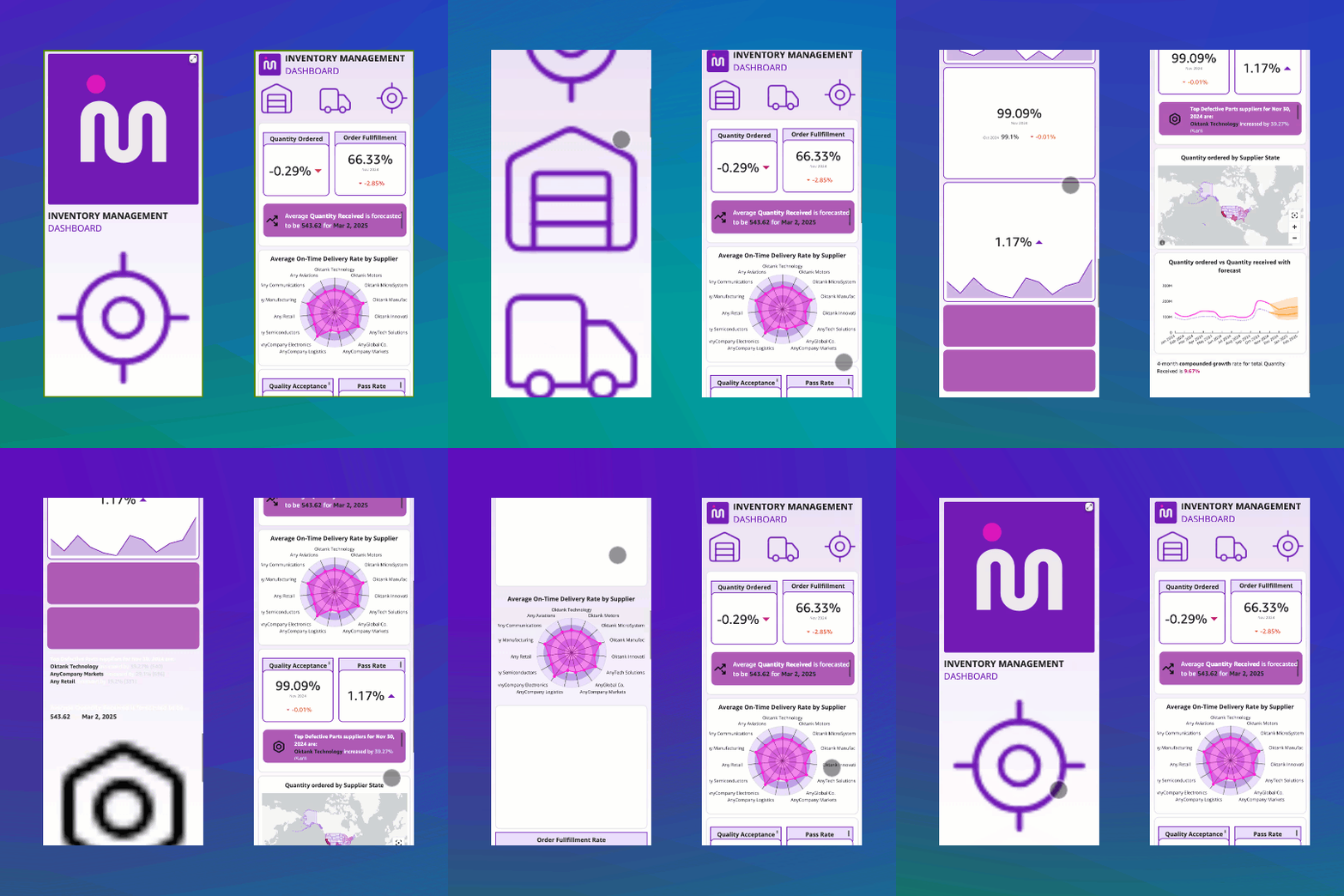
To experience Mobile Layout firsthand:
- Open a Free Form Dashboard: Access any existing Free Form dashboard within Amazon QuickSight.
- Use a Mobile Device: Open the dashboard on a smartphone or tablet, either through the Amazon QuickSight mobile application or a mobile web browser.
- Observe the Transformation: The dashboard will automatically render in the single-column, touch-optimized Mobile Layout, providing an immediate and intuitive viewing experience.
- Explore View Options: If using the mobile app, locate the "View switcher" control to toggle between Mobile view, Desktop view, and potentially Landscape view for different perspectives.
The "View switcher" control, visible in the QuickSight mobile app, provides a clear and accessible way for users to navigate between different rendering modes. This empowers them to choose the most appropriate view for their current task and context, whether it’s a quick glance at key metrics or a detailed analysis requiring the full desktop layout.
Broader Implications and Future Outlook
The introduction of Mobile Layout for Free Form dashboards by Amazon QuickSight is more than just a new feature; it’s a strategic move that aligns with the accelerating trend of mobile-first business operations. As workforces become increasingly distributed and the demand for real-time data continues to grow, the ability to access and act upon insights from any device is paramount.
This enhancement is likely to drive greater adoption of QuickSight among organizations that prioritize mobile productivity and operational agility. By removing a key friction point in mobile data consumption, QuickSight is positioning itself as a leader in providing accessible and effective business intelligence solutions for the modern, mobile workforce. The focus on "no changes required" for existing dashboards also means that the benefits are being realized immediately by a vast user base, without the need for extensive retraining or re-engineering of existing analytical assets.
Looking ahead, this development sets a precedent for how business intelligence tools should be designed in an era where mobile access is not an afterthought, but a primary consideration. The success of Mobile Layout for Free Form dashboards may well influence the development of similar capabilities for other dashboard types within QuickSight or inspire competitors to enhance their mobile offerings. The ultimate beneficiaries are the end-users, who can now leverage their data more effectively, leading to quicker, more informed decisions that can drive business growth and operational efficiency.
For further details and comprehensive guidance, users are encouraged to consult the official Amazon QuickSight documentation on customizing visuals in a free-form layout and other related resources. Feedback on this new feature is actively welcomed through the QuickSight console feedback mechanism, indicating Amazon’s commitment to continuous improvement and user-centric development.
About the Authors
- The Amazon QuickSight Team: This feature was developed by the dedicated engineering and product teams at Amazon Web Services, focused on delivering powerful and user-friendly business intelligence solutions. Their expertise in cloud computing and data analytics underpins the innovation seen in Mobile Layout.
This comprehensive update by Amazon QuickSight signifies a commitment to democratizing data access and empowering users with actionable insights, regardless of their location or the device they are using. The seamless integration of Mobile Layout ensures that the power of QuickSight’s analytics is now more accessible and effective than ever before.