Google Analytics Unveils Powerful New Drag-and-Drop Dashboards to Streamline Performance Monitoring and KPI Tracking

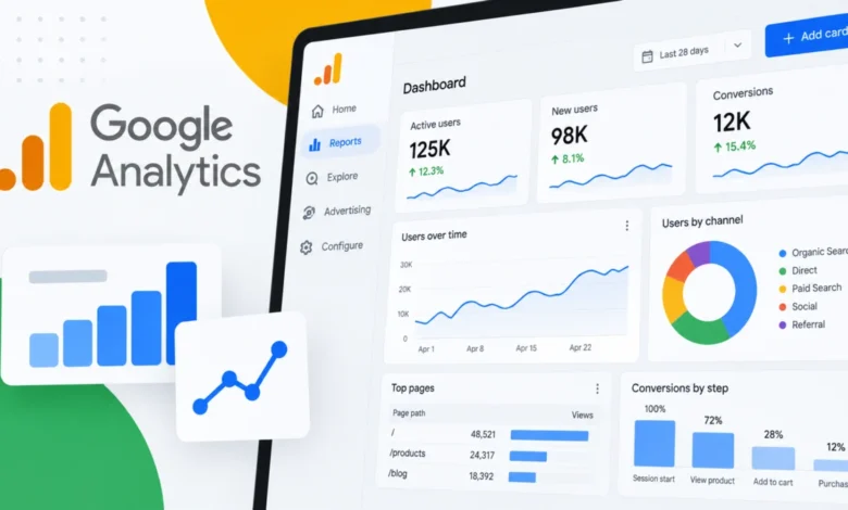
Google Analytics has officially introduced a major reporting upgrade designed to transform how businesses monitor, analyze, and visualize their digital performance. The newly launched feature, simply titled Dashboards, provides organizations with a centralized workspace that bridges the gap between disparate data points, bringing crucial Key Performance Indicators (KPIs) and dynamic visualizations together onto a single, highly customizable report canvas.
For digital marketers, data analysts, and corporate stakeholders accustomed to navigating a labyrinth of separate reports, the rollout represents a significant shift toward operational efficiency. By streamlining the workflow of data presentation, Google aims to eliminate the friction historically associated with cross-referencing metrics across multiple tabs and menus within the Google Analytics ecosystem.
A New Era of Visual Customization: The Drag-and-Drop Canvas
At the core of the new Google Analytics Dashboards feature is an intuitive, grid-based canvas designed to empower users to build bespoke reports with minimal technical overhead. Rather than relying on rigid, pre-packaged templates or constructing individual reports in isolation, users can now manually position, resize, and align visualizations using a flexible drag-and-drop interface.
To populate these custom views, practitioners can drag dimensions and metrics directly onto the workspace. This flexibility allows marketing teams to curate views tailored specifically to executive stakeholders, client reporting requirements, or daily campaign management.
At launch, Google is supporting six distinct visualization types, ensuring that users have the right tools to represent various data categories accurately:

- Scorecards: Ideal for tracking high-level KPIs, complete with percentage change indicators when date comparisons are applied.
- Tables: Suited for granular, multidimensional data reporting.
- Line Charts: Designed for tracking trends over time, featuring daily, weekly, and monthly viewing increments.
- Bar Charts: Perfect for straightforward comparative analysis across dimensions.
- Donut Charts: Useful for visualizing proportional breakdowns and traffic distributions.
- Funnel Charts: Essential for monitoring user journeys, conversion steps, and specific drop-off points throughout the funnel.
This diversity of visualization options ensures that teams are not locked into a one-size-fits-all reporting format, allowing for nuanced storytelling through data.
Accessibility, Publishing, and Workflow Integration
One of the most practical aspects of the new Dashboards feature is its seamless integration into the existing Google Analytics navigation structure. Once a team finalizes a custom dashboard, it can be published directly to the "Reports" left-hand navigation menu. This eliminates the need for users to constantly access the Google Analytics library just to locate custom-built reports.
However, access governance remains structured to protect property integrity. While the creation and publishing of dashboards require an Editor or Administrator role, the viewing permissions are democratized. Once a dashboard is published, any user with standard access to the Google Analytics property can view the consolidated report directly through the Reports navigation.
Crucially, published dashboards are shared universally across the entire property rather than remaining private to individual users. This ensures team-wide alignment, as all stakeholders are looking at the exact same performance metrics and visualizations.
Current Limitations and Boundary Conditions
While the launch of Dashboards brings welcomed flexibility to Google Analytics, the platform has implemented certain structural guardrails and limitations in its initial rollout phase:
- Card Capacities: Standard Google Analytics properties can accommodate up to 15 cards per dashboard, whereas enterprise-grade premium properties support up to 30 cards, allowing for more expansive data storytelling.
- Sharing and Collaboration: As noted, dashboards are communal property-level assets, meaning individual privacy settings for specific user segments are not currently configurable at the dashboard level.
- Technical Constraints: At launch, API support, advanced custom segments, and card-level comparisons are not supported, meaning power users relying heavily on programmatic data extraction or deep segmentation may still need to rely on alternative tools like Looker Studio.
The Broader Implications for Digital Marketers and Enterprises
The introduction of Dashboards addresses a longstanding pain point in digital marketing: fragmented visibility. Historically, tracking the holistic health of a digital ecosystem required jumping between acquisition reports, engagement metrics, monetization data, and conversion paths. By consolidating these disparate elements into a single-page view, Google Analytics is significantly reducing the time spent on routine performance monitoring.

For performance marketing teams managing multi-channel campaigns across paid search, social, email, and organic traffic, the ability to build a unified operational dashboard means faster identification of anomalies, quicker optimization cycles, and more transparent reporting for clients and company leadership. Rather than waiting for complex data engineering pipelines or exporting raw data into external spreadsheet software, marketers can derive immediate, actionable insights right where their data lives.
Context and Evolution of Google Analytics Reporting
This release fits into a broader, multi-year evolution of Google Analytics following the industry-wide transition to Google Analytics 4 (GA4). Since deprecating Universal Analytics, Google has steadily iterated on GA4’s interface, seeking to balance the platform’s event-based data model with user-friendly reporting capabilities.
Early iterations of GA4 faced criticism from the digital marketing community for having a steep learning curve and lacking the intuitive reporting fluidity of its predecessor. Features like the Analysis Hub—later renamed Explorations—provided advanced capabilities but often felt too complex for daily, high-level monitoring. The introduction of drag-and-drop Dashboards represents a concerted effort by Google to bridge the gap between advanced analytical depth and accessible, everyday reporting.
Industry Response and Future Outlook
While industry professionals are still actively testing the boundaries of the new feature, initial reactions from the digital marketing community have been largely positive. Agencies and in-house marketing teams alike have noted that the ability to publish custom views directly to the navigation bar streamlines client onboarding and internal stakeholder reporting.
As businesses continue to navigate an increasingly complex digital landscape defined by privacy changes, signal loss, and rising customer acquisition costs, the demand for agile, customizable data visualization tools has never been higher. Google Analytics Dashboards provide a timely response to these market pressures, equipping organizations with a streamlined mechanism to monitor their most critical metrics.
Ultimately, Google Analytics Dashboards mark a meaningful step forward in making enterprise-grade data visualization more accessible. By turning raw analytics data into purpose-built, drag-and-drop performance reports directly inside the platform, Google is helping businesses cut through the noise and focus on the metrics that genuinely drive growth.